
Accessibility is an important goal, not only—but especially—when creating OER.
What good are teaching and learning materials that have, of course, been published in accordance with FAIR principles and are openly available to everyone, if they are not equally accessible to everyone?
What exactly constitutes “accessible publishing” is explained, for example, on this European Union website: https://op.europa.eu/en/web/accessibility We have made every effort to implement the AA standard (WCAG 2.2 AA) to the best of our ability. We may not be completely accessible – but we’re working on it…
What does that mean?
We agreed on the following goals:
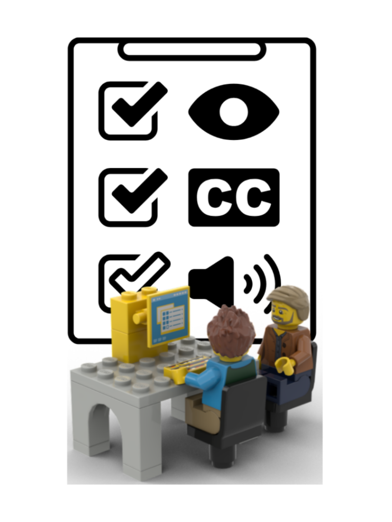
LEGO® is a trademark of the LEGO Group, which does not sponsor or endorse this material.
Video – Captions and Transcripts
Captions make videos accessible to people who cannot (or do not want to) hear the audio—sometimes even people with good hearing find themselves in situations where they cannot simply let the video’s audio blast away.
Transcripts also make videos accessible to people who cannot visually view a video, as they can be read aloud using common text-to-speech functions. At the same time, they allow users to search for content by keyword and make it easier to extract specific information or locate the relevant section.
Last but not least, both forms of written transcription simplify translation into other languages.
H5P
Our self-paced courses (in the HTML-based H5P Portfolio format) contain, as much as possible, only activities that have been classified as “accessible” by the H5P development team—that is, activities that can be controlled using a keyboard and are compatible with screen readers: https://help.h5p.com/hc/en-us/articles/7505649072797-Content-types-recommendations. In cases where individual course creators have nevertheless chosen activities that have not yet been evaluated for accessibility, we have ensured that these serve only as illustrations and are not the only way to access the information in question.
Image Descriptions
We have made every effort to provide meaningful image descriptions for all illustrations, diagrams, and graphics—even if they were merely “decorative” elements. However, H5P allows only a limited number of characters for image descriptions.
For example, if tables were created in another program for design reasons and then embedded as image files, standard alt text would usually not have been sufficient.
In such cases, we used the “Accordion” content block to include “Accessibility information.” When you expand the heading, a detailed description appears. Both sighted users and those who rely on screen readers can decide, after reading the heading, whether they want to expand the description or keep it hidden.
Hyperlinks
I stopped hiding hyperlinks—such as the URLs of DOIs or websites—behind different text a long time ago.
It’s a very common and very bad habit to write “click here” and place the link behind the word “here.” Often, you have no (or limited) way of seeing where the link leads, so you can’t decide whether you want to visit the page.
It’s much more honest to write, for example, “open the WiNoDa website COLON” and then spell out the linked URL. The link and the linked URL match, and in the event that the link is outdated—broken links are a real and widespread problem—you’re left with a URL for which you have a rough idea of when it last worked, and you can try to access the desired information via the Internet Archive’s Wayback Machine (https://web.archive.org/).
Bonus points if, as the author, you remember to save the cited website or resource in the Wayback Machine before linking to it.
Colors and Contrast
Our presentation templates have been designed with layouts and colors that should allow people with various visual impairments to easily distinguish between colors and contrasts. There are various online tools available for this purpose, such as https://barrierefreies.design/werkzeuge/kontrastrechner-fuer-farben#070a39-ffc830. The PowerPoint plugin “BrightSlide” (https://www.brightcarbon.com/blog/free-color-contrast-checker-for-powerpoint/) is also helpful.
In addition, we have tried to avoid relying solely on colors to convey information. A classic example is a traffic-light color scheme, where red stands for “wrong” and green for “right.” It’s easy to supplement “green” with a checkmark and “red” with an X, which not only reinforce the intended information but can also convey it in shades of gray. As is often the case, this benefits all users—after all, the material might be printed in black and white.
This also applies to our personas—in the dialogs, which convey the majority of our content in a question-and-answer format, each persona is assigned a color that is reflected in their clothing, the image frame, and the text color. At the same time, each change in speaker is announced by an image of the persona, so that even without the text’s color coding, you can tell who is speaking based on the image (or the image description).
Summary
These are some of the most important examples. While I’m sure we’ve left some things out and there’s still plenty of room for improvement, at least we’ve made an effort, and as awareness of the issue grows, habits are taking root and becoming more established. Whereas I used to find it time-consuming to write image descriptions, they now force me to carefully decide exactly what information an illustration, for example, is actually meant to convey—and to check whether it actually does so.
Furthermore, as is so often the case, it’s not just the group of people who depend on it that benefits—everyone else benefits as well from being able to read (rather than listen to) texts, search through them, understand materials even in black-and-white printouts, or trace broken links even years later.
Accessibility in General:
https://www.youtube.com/playlist?list=PLT5rARDev_rlXFW_OfOXbgJ1TvUCSNe_6
https://op.europa.eu/en/web/accessibility

Web Content Accessibility Guidelines (including h5p):
https://www.barrierefreiheit-dienstekonsolidierung.bund.de/Webs/PB/DE/gesetze-und-richtlinien/wcag/wcag-artikel.html
https://www.w3.org/TR/WCAG21
https://help.h5p.com/hc/en-us/articles/7505649072797-Content-types-recommendations

PDF:
https://pdfa.org/resource/pdfua-kompakt
https://www.bundesfachstelle-barrierefreiheit.de/DE/Fachwissen/Informationstechnik/Barrierefreie-PDF/barrierefreie-pdf.html
https://pac.pdf-accessibility.org/en
https://hochschulforumdigitalisierung.de/barrierefreie-dokumente-mit-markdown-latex-und-pdf-erstellen/
https://tu-dresden.de/tu-dresden/ressourcen/dateien/arbeitsgruppe-studium-fuer-blinde-und-sehbehinderte/anleitungen-word-powerpoint/Word_DE_20210201.pdf

PowerPoint:
https://barrierefreiheit.hdm-stuttgart.de/

on colour contrast:
https://www.npridik.de/farbkontraste-checken-cca

Simulate Colour Vision Deficiency (“Colour Blindness”)
https://barrierefreies.design/werkzeuge/kontrastverhaeltnis-von-farben-pruefen

Colour Selection
https://www.npridik.de/farbbarrieren-auf-powerpoint-folien-abbauen/

Tools:
https://www.brightcarbon.com/blog/free-color-contrast-checker-for-powerpoint
https://apps.microsoft.com/detail/9p198gcw02l1?hl=en&gl=EN

Datenvisualisierung (Charts, Grafiken)
https://chartability.fizz.studio